In these Behind the Magic series, we give an overview of what we worked on the month before. Please be warned that the contents might get a little technical now and then.
I never thought that rain would actually make me happy, but seeing Homey v2.0's new Weather Screensaver light up as raindrops hitting the ground... it definitely made me smile.
I don't think we have ever felt as much pressure as a team, as we feel right now. At Athom, we've been using Homey v2.0 for some time now internally. Sometimes we forget that the things we're using is not what all of you are using. Looking at what's currently out there, while we're still very proud of it, we feel it's time to move on to Homey v2.0 with the new smartphone app.
While it's not just there yet, I will give you an update how far we've come and that, yes, we will start testing Homey v2.0 in the first weeks of November with the enthousiasts in Athom's Alpha Tester Program. I'd love to give you already a sneak preview of some of the screens.
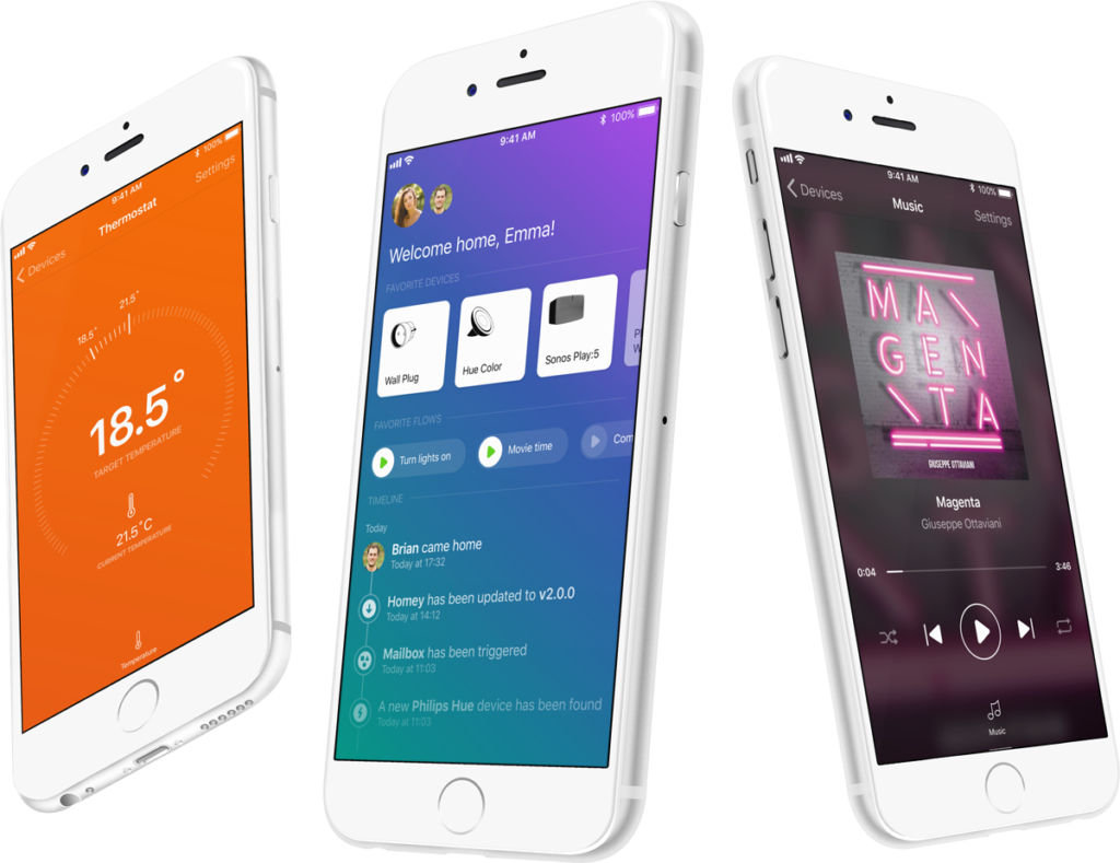
The app has almost all features you'd expect of it. The first thing you'll see is Home, which shows, well, your home. It's the middle screen in the photo above.
Home shows your family and who's home, and you can quickly mark people as Home/Away and Asleep/Awake.
Your favourite devices are visible just below, and with a single tap you can turn them on or off. Different devices have different quick actions, such as a Speaker will pause or resume playback. You can pick your favourite devices yourself from the Home screen as well, and even rearrange them.
One block down are your favourite Flows. In Homey v2.0, most Flows can be started with the press of a button. Only those with Tags in use cannot be started by yourself, because then the tag's value would be unknown. Starting a Flow makes it easy to create scenes, like Movie time and Dinner.
On the bottom of the Home screen are your home's notifications. It tells you the most important things happening in your house, and with Homey.
The second screen is Devices, and looks similar to your favourite devices — but longer. Holding down your finger on a device opens the device in fullscreen, like the thermostat and speaker on the photo above.
Viewing the device fullscreen is an experience that gave us the opportunity to rethink many interface elements. And the best thing is that the back-end of Homey is still the same, so all your current devices will automatically look gorgeous. We've added a few new types as well, such as album art for speakers.
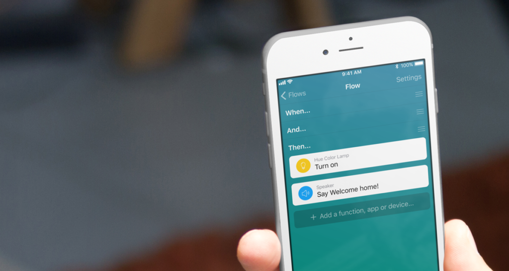
The third screen is Flow, where all your automations can be found. Flows are still made the same, with When, And, Then columns. They just are vertical now. The option to drag a card into an or or else column happens automatically when moving the card around.
A Flow card could have input fields (e.g. a color, or what to say). These have never had a title to describe what they were for, so we've added that functionality for app developers to add. All developers will receive an e-mail with all changes when Homey v2.0 is released as Experimental update.
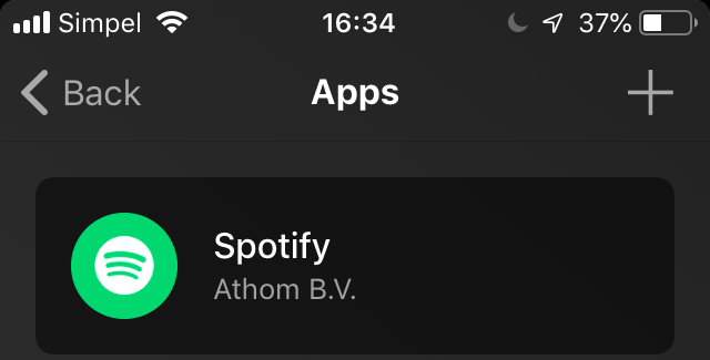
The fourth item, More, holds several subitems: your Athom account, Apps, Alarms and Logic. We've added support for brand colors for apps as well, to make them easier recognisable.
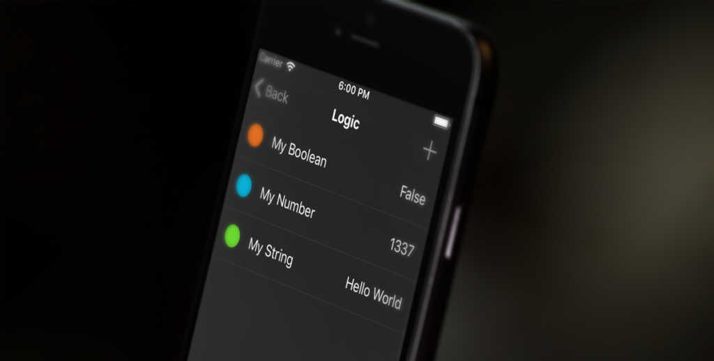
Logic is something that can't be found in the current desktop app. It's a single place to manage variables for use in Flows. Very useful for the advanced user.
I even think the settings screen looks great, but that's something you'll have to find out yourself!
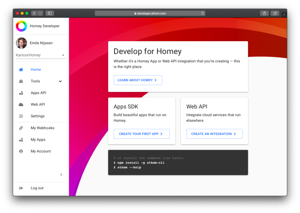
Some of you have been worried that by dropping the desktop app it would be hard to develop apps for Homey. I'm very proud to say that as of last week we have a brand new Homey Developer website that has many tools to aid in app development.
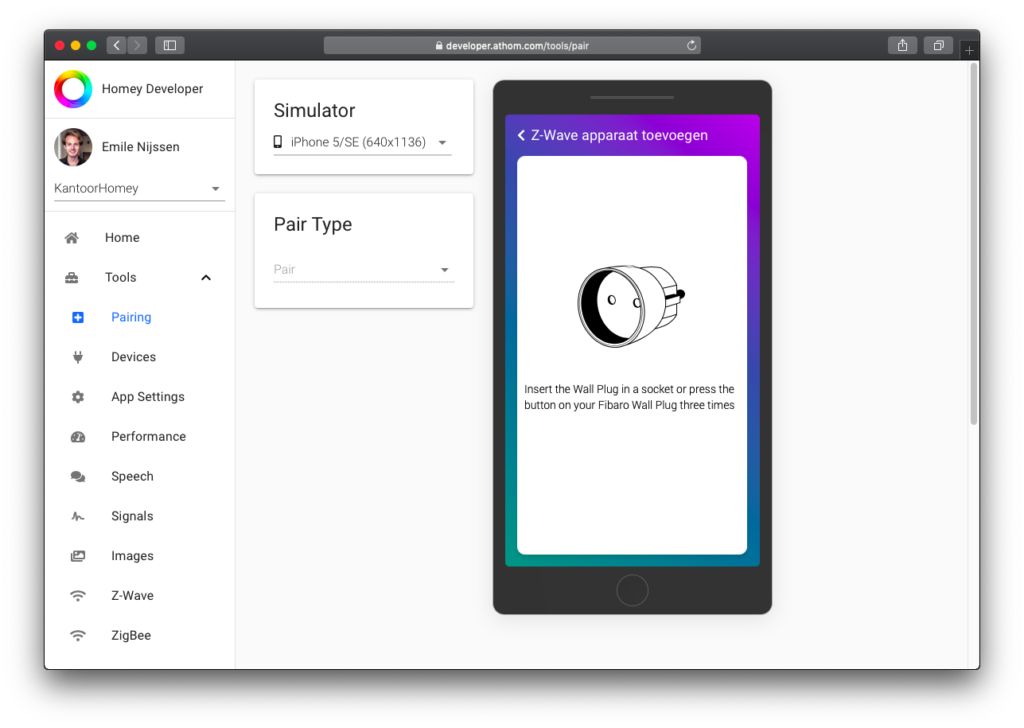
From here, developers can add and remove devices, view device's info and current state, test their app's settings pages, profile their app's performance, test their speech, record signals, view their images (e.g. album art), debug Z-Wave and ZigBee, play with the Web API and manage their Webhooks. Go check it out!
And we've also updated Athom CLI to automatically log you in, and show a link to the App Profiler on the Homey Developer website.
Last but not least: we've created Dutch support for Google Home, and Google Assistant Smart Home support, which allows you to control most of your devices without saying Hey Google, ask Homey to. They're both under review at Google and when all goes well, will be released next week.
Next month, we'll be making sure that all this goodness will be available to you.
— Emile


