Homey v2.0 has been released this week, and we’re excited to share everything that’s new. This is the second in a series of three posts telling the story of Homey v2.0.
The two most used functionalities of Homey are by far devices and Flow. Together they form a powerful combination where you can automate your devices, such as turning on a light when a motion sensor detects movement.
Creating a great experience on mobile for both devices and Flow were two separate challenges. They are very distinct features, yet work so closely together. In this post we dive in-depth for both features.
Devices
Homey supports more than 50.000 devices from over 1.000 brands. This is mostly due to the apps created by the companies behind these products and the Homey community.
Many users have more than ten devices in their home, and some even up to 50 or more. It was a no-brainer that we needed to design an interface that works for many devices but still looks great.
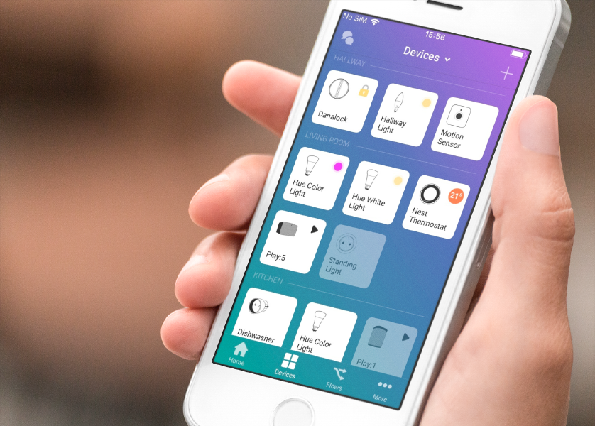
All your devices are visible in one screen, and many of them show their live color, temperature and on/off status. In fact, this already starts to look like a dashboard, something many users have requested.
Your home is not so simple
Homey is very unique in supporting your home's zones hierarchically. We took this concept even further by showing all devices in a specific zone, and its underlying zones.
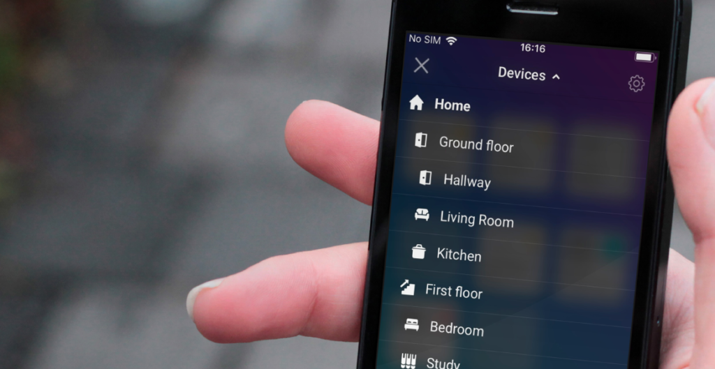
By default the Devices screen shows all your devices. Tapping the title shows your zones. Selecting a zone shows the devices in that zone.
For example, selecting First Floor shows all devices in First Floor, but also Bedroom, Bathroom and Study, as these are part of the First Floor. And saying "Turn off all devices on the first floor" as speech command finds those devices and turns them off.
Supporting 50.000 devices
There are many devices and they all have their own features. It was our job to design a system where devices across brands look and feel similar, but not at the expense of their unique features.
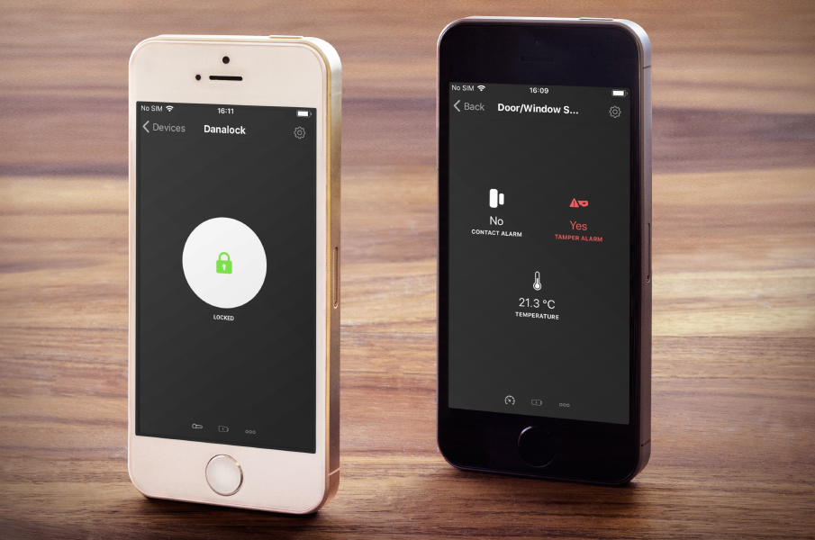
To accomplish this, Homey defines devices based on their capabilities. These are properties like Turned On, Brightness and Color. We define the most-used capabilities for developers to use. Devices that do something special can create their own capability.
In the Homey app, these capabilities are used by Components. They are the buttons, sliders, color pickers, sensor values, etc. you see in the app. They make sure that different devices with the same functionality also look and work the same throughout Homey.
If you're really interested in the inner workings, head over to the developer documentation »
Device settings
Managing the settings of a device is a breeze on Homey v2.0. Simply tap the gear and you can always change the device's name and zone.
Some devices, such as wall plugs, have a special setting: "What's plugged in?". Selecting a light, for example, will make the device behave like a light in both the UI, Flow and speech commands.
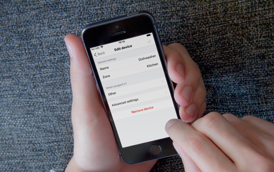
Some advanced devices may have a few to many settings you can change. Especially Z-Wave devices are infamous for their list of settings. Luckily in Homey the settings are user-friendly (compared to other controllers where it's not unheard of to look up hexadecimal codes in a manual).
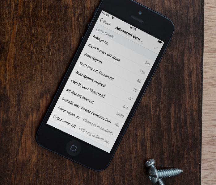
Changing these settings is as simple as setting a new value and hitting save.
Adding a device
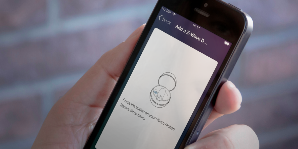
We've put much work in making it easy to add a new device. With Homey v2.0 this is easily done on your mobile phone in the device overview.
After tapping the plus-symbol you can pick a brand or search the app store. The next step is to select the kind of device you want to add, and then you enter a device-specific interface. This way you always know exactly what to do.
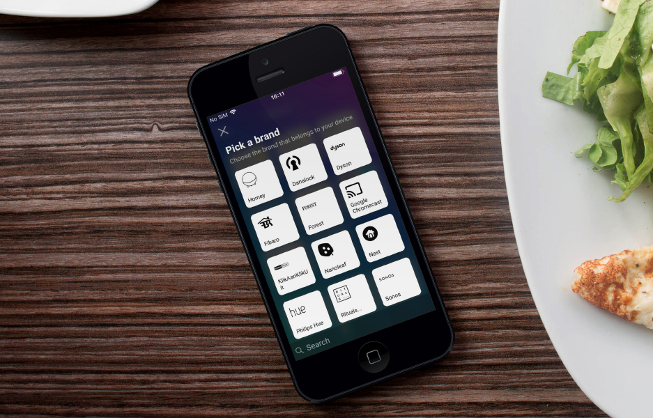
Homey already had great instructions specifically for the device you were about to add. These are usually an instructional text accompanies by a beautiful image. We've now made sure adding a device looks great on mobile as well. By providing developers with standard templates for logging in, a list of devices and loading indicators the experience feels uniform across brands and devices.
Device Insights
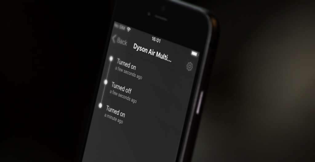
A device has two types of insights:
- a timeline, which shows Yes/No values such as Turned On and Alarm went off.
- charts, made by numeric values such as sensor values and energy usage.
In the Homey app, a timeline of the last 50 events is shown so you know what happened when. Tapping an event even shows the exact date and time.
Tomorrow we will dive even deeper into Insights.
Flow
When we announced that Homey was going to be mobile-only, we knew there was a big challenge ahead of us. Fitting the fullscreen Flow editor on a smartphone screen was no easy challenge. But as limitations arise, creativity increases exponentially.
Figuring out what worked and what didn't took some time. We even experimented with a horizontal scrolling Flow editor with columns, but that had many problems and felt cumbersome.
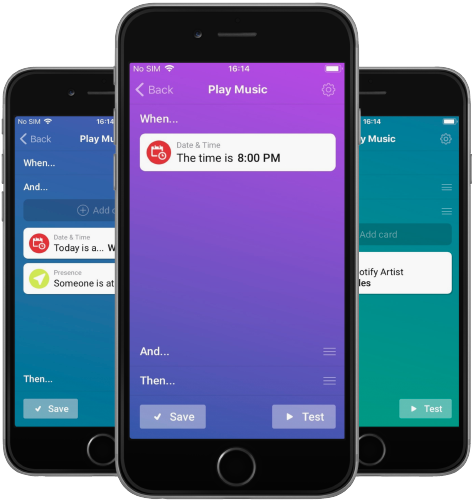
In the end we found that a vertical list was not only more logical (text reads from top to bottom in almost all cultures) but also worked fastest. In one tap or swipe you could be anywhere.
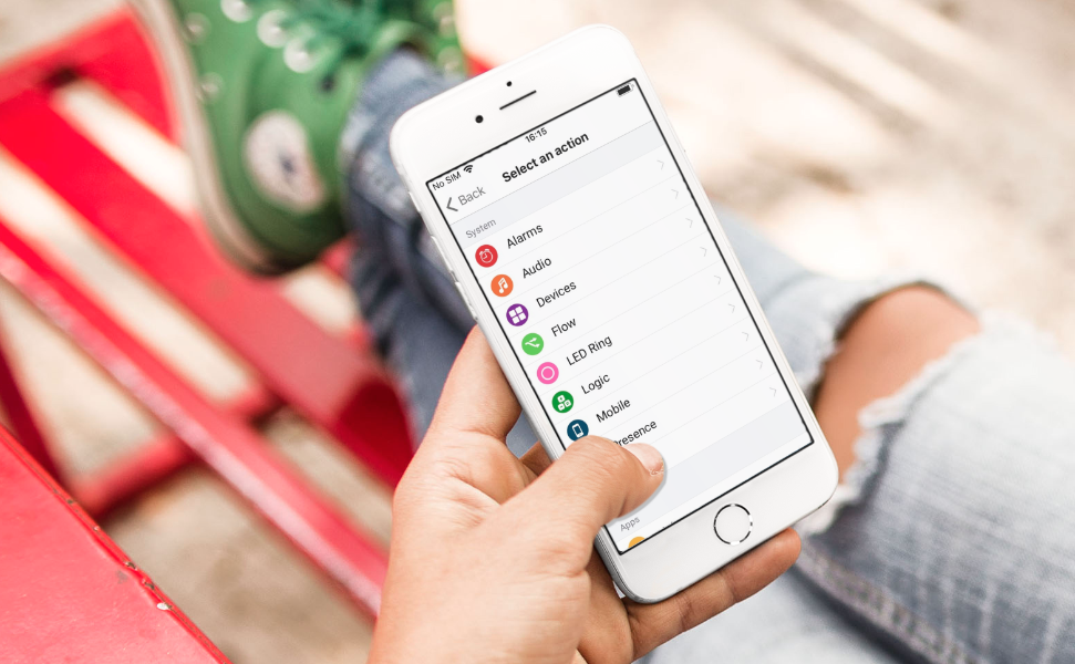
Exploring which cards can be added to your Flow is also easy. They are in a list grouped by system, apps and zones. Finding the right card is just that little easier now.
Starting Flows manually
A much requested feature was to start a Flow from the app. In Homey v2.0, tapping the play button runs the Flow once. Almost all Flows can be started, except for those where a Tag is being used that's used in the first card.
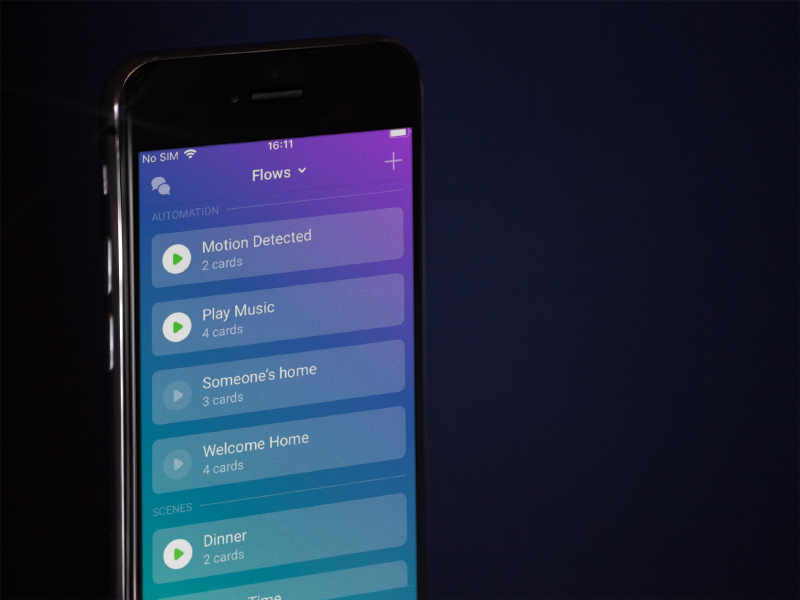
Flows can be started from the Flow list and from the homescreen. And who knows, maybe from an iOS or Android widget in the future?null
Or and Else
To create advanced Flows, in Homey v1.5 it was already possible to create or and else groups. These groups of Flow cards can make your Flow even smarter.
It works as follows. If one of the or groups has cards that are all true (this is visible by a green check mark during testing), the Flow proceeds to execute all cards in the then group. If none of the or groups are true, the cards in the else group are executed.
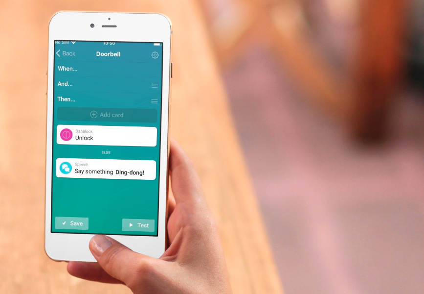
In the Homey app this behavior didn't change. You can add Flow cards to a group easily — just hold and drag them down and the group will automatically appear.null
Tags
Flow tags are those colored things that create more advanced Flows. For example, a tag can be the name of a user that just came home, so you can say "Welcome home, <name>".
A Flow has two kind of tags:
- Local tags, provided by the Flow event card
- Global tags, provided by Homey
A local tag is one such as the name example above. Global tags are values in Homey, such as the current weather temperature or if a device is turned on or not.
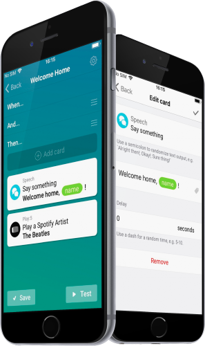
Both types of tags can be used in your Flow. For this to work we had to develop our own Textfield-component for iOS and Android, but it's well worth it! Using tags in a Flow is both easy and very advanced. Essentially, it's variables for non-programmers!
Hopefully you've enjoyed this in-depth post! We had a great time designing Homey v2.0 and couldn't wait to share it with the world. Now that it's released, go check it out for yourself!


